

Choosing the right colour for your outdoor furniture: our tips
WHAT’S YOUR COLOUR?
Faced with an increasingly bewildering array of colour charts, it can be hard to choose the right combinations. Will I make the right decision? What if my chosen colours date quickly? These may be existential questions, but Mathilde and Marion, Fermob’s visual merchandisers, are here to cut through the grey areas (no pun intended!) with some tips to help you choose a furniture colour (or colours) to suit your style.
To help you make the right decisions, you’ll need to answer some simple but essential questions about your environment:
Am I buying furniture for my home? My garden? My patio or terrace? Whereabouts do I live?
Ultimately, the sky’s the limit outdoors. But since the garden is a room in its own right, we don’t want to lead you down the wrong path. Sometimes you can use the colour of your wall, the ground or even your shutters as the starting point for your furniture. And the area where you live can even be an important consideration.
Where should I start? What main colour should I choose for my furniture?
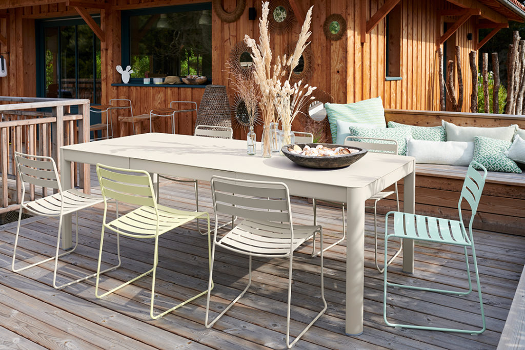
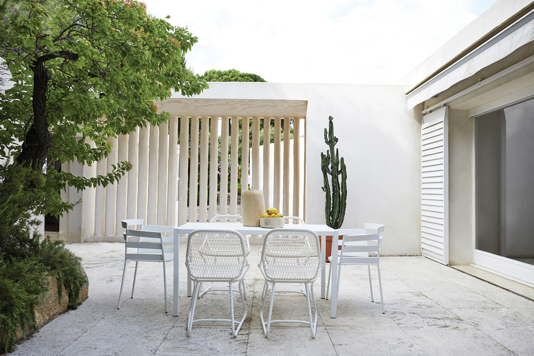
As a rule of thumb, you should start by choosing the colour of your table, since it’s the biggest item of furniture in your set. Next, you should focus the colour of the seats. We strongly advise you to have at least two seats in the same colour as your table, to ensure you get the balance right. This is the starting point for your colour combination.
“Romane” table Rosemary color, “Dune Premium” seats Rosemary and Lagoon Blue colors and “Happy Hours” pedestal table Lagoon Blue.
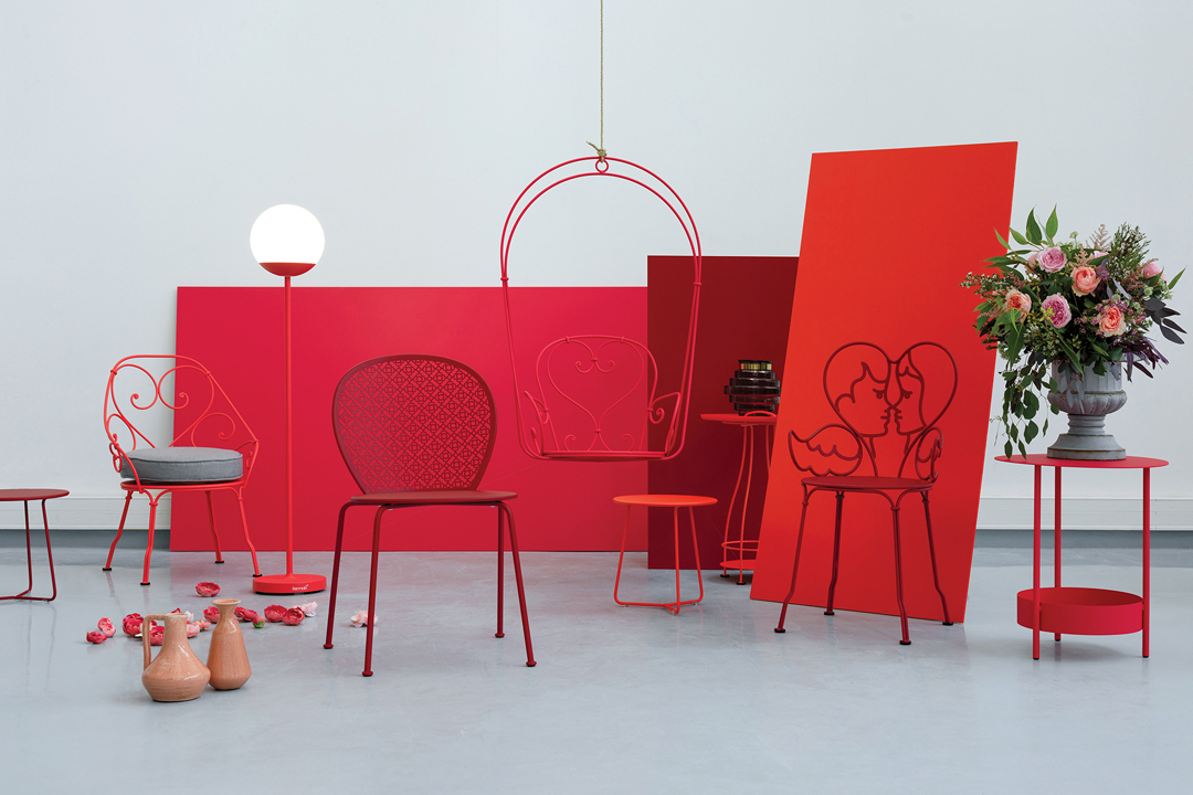
I want bright colours, but I’m afraid they’ll date quickly.
It’s true that fashions change at breakneck speed. Will today’s trends stand the test of time? At Fermob, our colour chart strikes the right balance between tradition and modernity. All our hues are designed to be timeless. So you’re unlikely to make a choice that’s in poor taste with us! Our experts recommend using bright colours for your seats and more neutral tones for your table. Smaller items such as pedestal tables and lamp stands are also ideal for adding a bright, joyful, colourful note to your set.
To the left: “Monceau” table Nutmeg color and “Monceau” seats Nutmeg, Pink praline and Honey colors.
To the right: “Caractère” table Nutmeg color and “La Môme” seats Numeg, Cotton white and Honey colors.
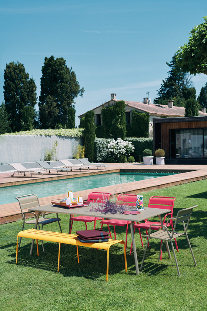
Is there a maximum number of colours?
It all depends on the size of your table. Ideally, for a four-seater set, you should limit yourself to two colours. For larger sets, you can go for up to three colours. But for the sake of consistency and style, you should avoid mixing too many colours from different points on the spectrum.
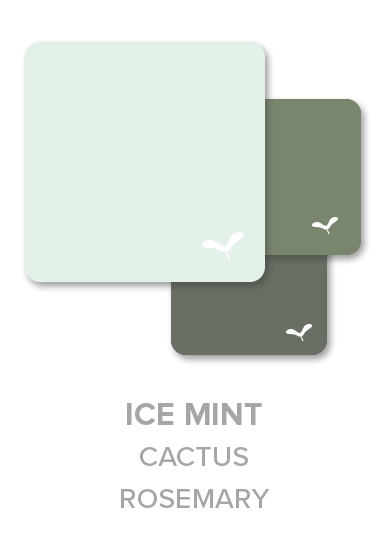
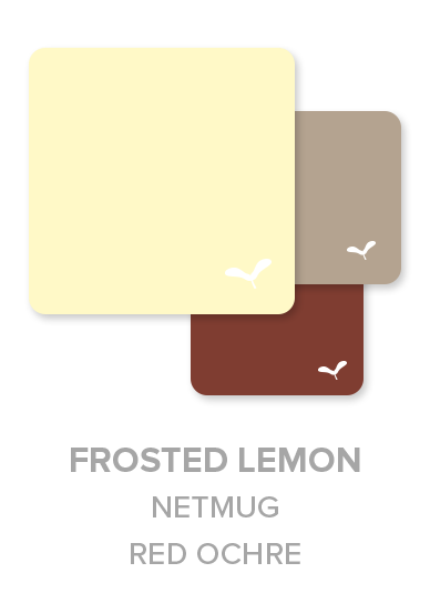
“Ribambelle” table Clay Gray color and “Surprising” seats Clay Grey, Frosted Lemon and Ice Mint colors.
What style should I go for? How do I combine colours?
We’ll help you create harmonious combinations from our selection of 24 colours – modern, nature-themed or warmer monochrome pallets. Green hues like Rosemary, Cactus, Willow Green and Cedar Green will give your setting a natural, plant-themed look. And why not add Verbena for a brighter, more vibrant green? Conversely, if you’re looking to accentuate the lines of your products, more modern tones like Anthracite, Deep Blue and Liquorice are the order of the day. Meanwhile, if you want to add some warmth to your setting, we’d recommend Russet, Red Ochre and Chili.
Lastly, our new pastel tones, hot off the press for 2020, are great for adding a brighter, more subtle touch: Clay Grey, Ice Mint and Frosted Lemon.


Can I go for a monochrome look, or is that too bold?
Of course you can! Bold is good! A monochrome look is perfect if you have a particular penchant for one of our colours. Why bother looking elsewhere when you’re in love? As well as making a strong character statement, going monochrome means you can vary the seat models and even mix and match from multiple collections. Because when you’re consistent on colour, you don’t have to be consistent on style! It’s another way for you to personalise your set.
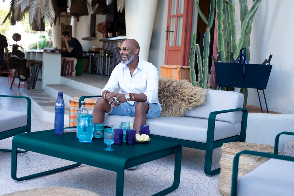
To the left:”Bellevie” collection, Acapulco Blue color.
To the right: “Inside Out” table with “Sixties” and “Rythmic” seats Cotton white color.
There’s a lot of talk about the garden being a room in its own right. What tips do you have for decorating and fitting out the garden and bringing it to life?
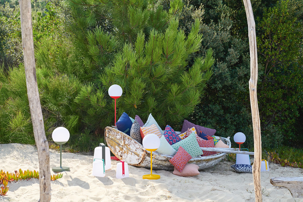
At Fermob, we make products for every part of the garden. Our lighting products, for instance, are designed to help you make the most of your outdoor space, well into the evening. After sunset, our Balad lamps – in multiple sizes – will light up your garden with a range of lighting moods. Warm or cool, the choice is yours. Our Mooon! lamps, meanwhile, are a nod to Parisian street lamps and bring a touch of character to the garden. With their chargeable, mobile design, our lamps are designed for all aspects of outdoor living.
You can also assert your personality by opting for pieces from our range of accessories – cushions, trivets and even trays, all with playful patterns that will really accessorise your furniture. These items, designed for 100% outdoor use, are a great way to add some bright colours to your garden!
What’s your favourite Fermob piece?
Mathilde: For me, it’s the Mooon! lamp. With its distinctive Parisian style, it casts a warm glow over all my special moments outdoors. And the Honey colour makes a real statement, too!
Marion: My personal favourite is the Sixties chair. As its name suggests, the style is straight out of the 1960s – and in Cotton White, the colour lets the design do the talking. It’s understated yet bursting with character, and it looks great when combined with an Envie d’Ailleurs cushion.
